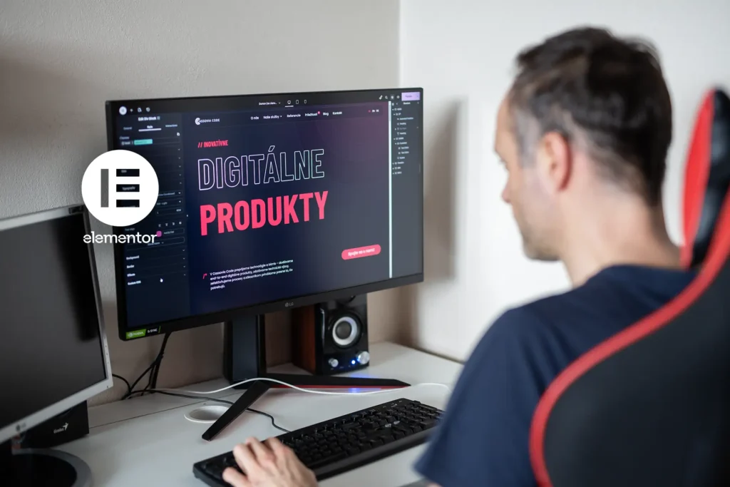
With Elementor 4.0 currently being released, I decided to share my own perspective on this new version. Since I’ve been following the V4 editor from its very first test releases, I wanted to sum up how it feels to me today, what I think it brings to the table, and where I see its biggest strengths and weaker points – although, in my opinion, there are very few of the latter.
What Elementor Is Used For
Elementor is a visual page builder for WordPress. It was launched in 2016 and quickly gained popularity because it was one of the first tools to introduce a solid live drag-and-drop front-end editor. It significantly simplified the user experience, was available for free (with the option of a Pro version), and thanks to that, it spread very quickly. For many years, it was built mainly around a widget-based approach.
With the arrival of V4, however, it is no longer just about new widgets, but about a completely new editor architecture. There is a much stronger emphasis on a CSS-first approach, the separation of structure, styling, and content, and a more systematic way of building through classes, variables, and components.
While older versions of Elementor were especially strong at quickly assembling pages through widgets, V4 moves the editor closer to a modern front-end approach: fewer one-off settings, more systemization, reusability, and order.
My Opinion and Experience
have been generally positive since the very first alpha version. Elementor has gone through major development and a large number of changes on its way to the final release, even though there are still quite a few things missing. On the other hand, it is clear that the developers are listening to the community and responding to feedback.
A Big Shift in the Way of Thinking
For people who understand HTML and CSS, this is a step forward. Elementor’s original idea was to simplify website creation for everyday users through easier mechanics. Now, however, it is moving toward an approach that is much closer to a classic HTML and CSS workflow, only in a visual form. For me personally, that is ideal, but for people looking for simplicity and a short learning curve, it may be more demanding, especially because of the broader and more complex options.
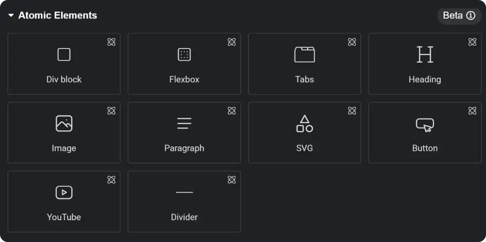
Fewer Widgets, More Room for Creativity
For now, the V4 editor does not offer many ready-made widgets beyond the absolute basics. That means we have to build a lot of things ourselves – for example, a button with an image, a CTA section, a testimonial, an image box, and other elements. Of course, it is still possible to use the old widgets as well, but you have to be prepared for a completely different interface. In practice, this often means jumping back and forth between the new environment and the old one, which can feel a bit chaotic, since atomic widgets work and look completely different.
Because so many new options have been added, the entire menu has expanded as well. As a result, clicking through it is sometimes less intuitive, even though everything is divided into categories. On the other hand, most settings are finally unified, especially in the Style section, which gives widgets more consistent controls.
In the Size section, we finally got not only width and height, but also min and max values as well as aspect ratio, which is very practical when working responsively.
Do you like gradient text in headings? We finally have it natively in Elementor. If you want to place an image directly inside text, that is no longer a problem either, and you can even continue to work with it visually through layering.
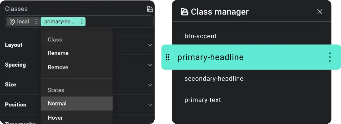
Classes
Classes are a core principle of working with styles, and now they are becoming part of Elementor as well. They bring a great deal of freedom while also opening up new ways to optimize a website and maintain a consistent design. On the other hand, this is one more thing that needs to be learned and understood, so for a complete beginner it may not be the easiest concept to grasp. Even so, I definitely think it is worth learning.
Overall, it is handled in a fairly clear way. The different layers are color-coded, and in the Class Manager we can manage classes comfortably. In practice, this means I can create, for example, a style for a heading, assign a class to it, and then apply that class to other headings. When I later change that class, the changes appear everywhere it is used. The same applies not only to text, but also to images, sections, and other elements.
Hover states are also set through classes. It is admittedly a little more complicated than it used to be, but at the same time it brings greater control and freedom.
Components
Components are, in my opinion, another big thing. You only need to create one component and then use it across the entire website. At the same time, you can define which parts of it will be changeable, which gives you a very strong combination of consistency and flexibility.
In practice, this means I can create, for example, my own button or an entire section that is meant to be repeated multiple times across the site. Instead of rebuilding it over and over again, I create it once, and in each additional instance I only change the text, image, or other content I want to make different. If I am not mistaken, this feature will only be available in the Pro version.
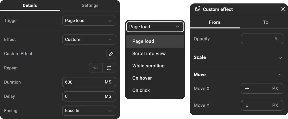
Interactions (Animations)
These animations still do not quite match the possibilities offered by Webflow, but even so, we have gained a great deal of freedom in the settings. It is finally possible to create animations more in line with your own needs instead of relying only on predefined effects, which were often far from ideal. Various triggers for launching animations have also been added, such as page load, scroll into view, while scrolling (Pro), on hover (Pro), or on click (Pro).
Atomic Form
Atomic Form is a completely new way of creating forms. It is no longer a single ready-made form widget, but rather individual parts from which we can build a form exactly the way we want. This approach gives much greater freedom both in design and in customization.
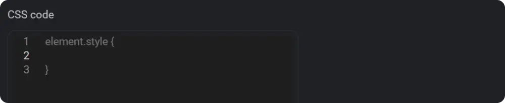
Custom CSS
Custom CSS has also gone through a major change. It is no longer necessary to define a selector for a specific object the way it was before. You only need to add the CSS code itself, and one major advantage is also the improved handling of responsiveness. Thanks to that, we can now have separate CSS settings for individual breakpoints.
The whole idea behind the new Elementor V4 is built around the concept of Atomic Design, which is a methodology for creating design systems that helps ensure consistency, flexibility, and better scalability for websites.
Conclusion
Is this a step in the right direction? In my opinion, yes. Elementor V4 brings more freedom, better systemization, and a more modern way of working. It is true that some things are still missing, and not every change will suit everyone, but it is clear that this is exactly the direction Elementor will continue to move in. At the same time, it is important to recognize that this is only the beginning. There is still a lot ahead, more features are planned, and the whole V4 editor will continue to be gradually expanded and improved. That is why I believe it is worth starting to get used to this new approach already now. Finally, I will add Roadmap.


